Healthcare in India is family-unit behavior, not individual. If you capture health data for 4-5 family members, you can create exponentially more business through personalized interventions, reminders, and service recommendations. Yet every health platform around 2018 treated users as isolated accounts.
Case 1
Family Architecture
Building switching cost moats through household management , making family the foundation, not a feature
76%
Onboarding Completion
3.2x
Revenue Multiplier
1.7%
Engagement Lift
Case 2
Engagement Loops
Content as Conversion
eBooks, self-tests, video shorts , building lightweight engagement loops that drive consultations
64.3%
e-Book Conversion
4.7%
Self-Test → Consult
1,500+
Video Shorts Created
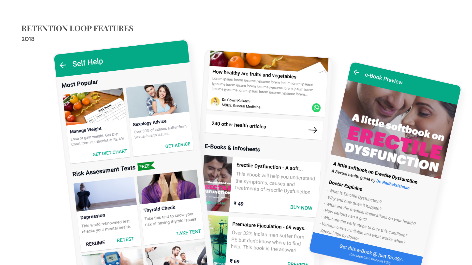
The Problem
Healthcare is low-frequency by nature. Users only opened app during "crisis moments." Needed continuous engagement between transactions without forcing consultation purchases.Challenge: Create value loops that bring users back regularly.
The Decision
Three lightweight engagement loops:
1. eBooks (₹49-59): Data-backed content on taboo health topics users won't discuss publicly but will read privately. Created in 5 languages. 64.3% conversion rate.
2. Self-Tests (Free): Chat-based health assessments (depression, thyroid, cardiac risk). Score-based CTAs: risky scores → consult doctor, medium scores → book checkup, safe scores → educational blogs. 4.7% conversion to online consultations.
3. Video Shorts (1-2 min): Led production of 1,500+ doctor-narrated videos in 5 languages. Teaser content addressing common & private health concerns. Drove installs and SEO via youtube and consultations (in-app videos as well), users related to problems, wanted professional guidance that was available instantly.
Why It Worked
Lightweight, bite-sized, data-backed consumables targeted based on user behavior analysis. Almost nobody but the patient would know their private concerns, building trust through discretion (e-books/online consults). High hit rate because content matched actual user needs vs assumed needs.
Case 3
R2C Reorder
Physical → Digital Innovation
Digitizing physical receipts into frictionless reordering , industry first, bridging offline to online
2.5x
Cashless Lift
8.7 Crores in 6M
Long term ₹100Cr feature ARR Target
45%→41.7%
Reimbursement Drop in 6M
Case 4
Medicines Cart Psychology
Contextual Revamps
5.3% AOV lift through behavioral design, education over speed in trust-sensitive categories
5.3%
AOV Increase
1.2
Additional Cart Items
18%
More OTC Seen
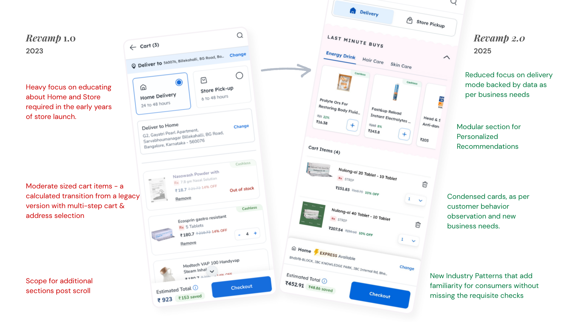
The Problem
Pharmacy checkout being rebuilt for tech upgrade,risk of massive engineering effort with zero UX improvement. Meanwhile, users checked out with prescriptions only. 40% never saw OTC (over-the-counter) products below fold. AOV potential unmet.
The Decision
Counter-intuitive bet: Healthcare doesn't push products. But understanding audience shift (benefits-driven employees vs anxious patients), we realized checkout conversion wouldn't suffer from strategic OTC placement as corporate users had to utilize their wallet money anyhow before expiry. Moved OTC above fold, 18% more users could now see them.
Behavioral insight: Data-driven recommendations for users for maximum relevance & impact. Positioned OTC as "complete your health routine" not upsell. Created impulse purchases without disrupting checkout,increasing AOV without hurting conversion.
Execution excellence: Fixed category naming (UX writing cleaned confusing terms), tested recommendations thoroughly, ensured data/tech/design worked in parallel.
Why It Worked
Corporate Healthcare checkout psychology differs from general retail. Users are ok to add a few relevant out-of-pocket (payable) items if most of their cart is corporate sponsored. For retail login users this same modular section was placed below the cart. Audience acceptance confirmed AOV increase per transaction.
Case 5
Walk-In Innovation
Offline-Online Bridge
Digital wallet for physical doctor visits , seamlessly using benefits at clinics, creating omnichannel healthcare
Unique
First in India
Potential
5%-7% Conversion Uptick
Case 6
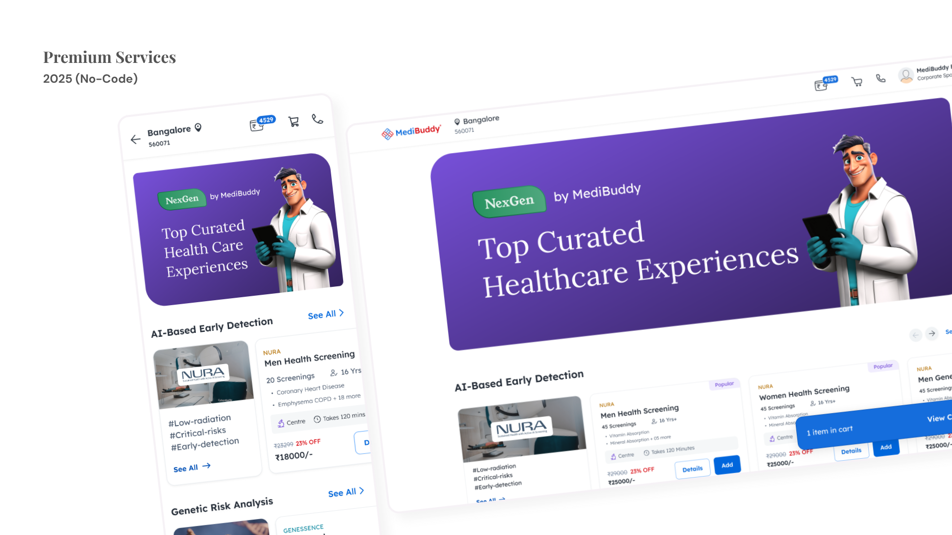
NextGen AI Genetics
High-Ticket Education-First
Launching AI-powered genetic screening , education-led design for high-value health services
High-Ticket
New Revenue Sub-Vertical
New & Premium
Education to lead/sale
The Problem
Genetic screening is complex, expensive, and poorly understood by consumers. Traditional approach: overwhelming users with scientific jargon, leading to drop-offs. High-ticket services require education before conversion, not after.
The Decision
Education-first architecture: Don't sell genetic screening,teach users why they need it. Multi-step educational journey explaining: What is genetic screening? Who needs it? What can you learn? How does it work?
AI-powered personalization showing relevant genetic insights based on family history inputs. Progressive disclosure of complexity,start simple, deepen based on user engagement signals.
Why It Worked
High-ticket health services compete on trust, not price. Education builds trust at scale. Users willing to pay premium once they understand value proposition. AI personalization made generic service feel individually relevant.
Case 7
Service Discovery Hub
Platform Over Departments
Multi-service exploration page , solving home screen real estate wars while enabling rapid service launches
10%
DAU Engaging
₹50L+
Monthly Revenue
1 Week
Build Time
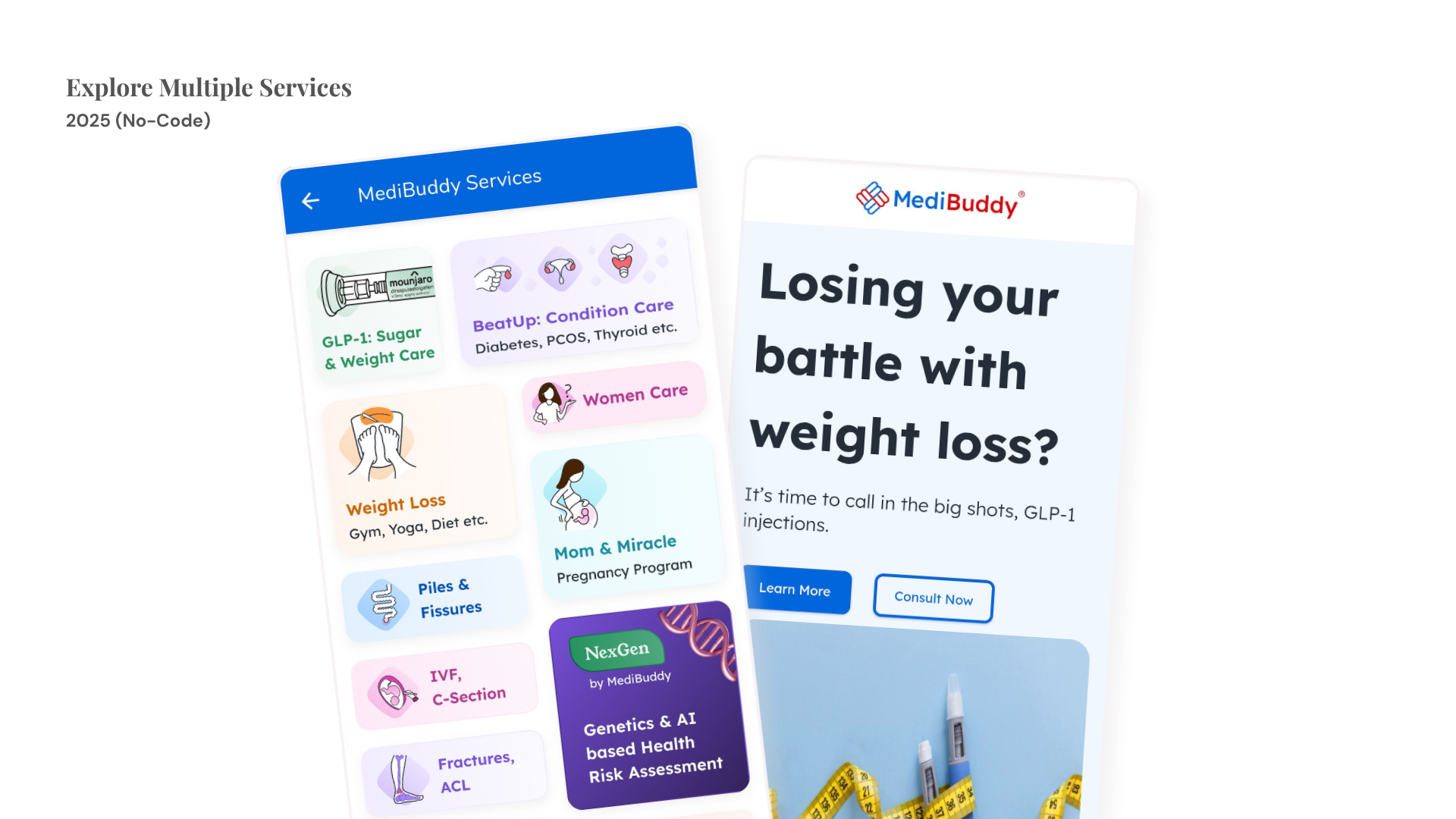
The Problem
By 2025: 15-16 services/features on home screen. Cumbersome for users to identify core vs special services. Every department fighting for prime home screen real estate. High-ticket, high-margin services needed exposure. New service launches required months of implementation.
The Decision
Multi-service hub instead of departmental wins. Refused individual page requests from business units. Built fast no-code explorer showcasing all new services + sub-categories of existing high-ticket services.
One step from home screen bottom nav → "Explore" page. Maximum visibility without cognitive overload. 10+ services visible on first fold. Built in one week (design + development, no core engineering).
Why It Worked
Design differentiated from other pages,felt like discovery vs transaction. Users could browse & understand variety without cognitive load. Fast launch = reduced implementation cost, increased business value. One architecture serving multiple business units vs siloed solutions.
Case 8
Personalization
Modular Intelligence
Flexible home screen architecture , balancing business needs, personalization, and user experience under tech constraints
Modular
Reusable Architecture
Zero-State
First-Time Guidance
Smart-Nudge
Returning Users
Highlights
Consumer Obsession
End-to-End Ownership
₹400Cr+ Design Impact
Design systems that work for users but also scale for the org.
Experiment, Fail Fast, Empathize with Team & Customers.